Design systems
Secure Communication App
Took a one-line brief from leadership to SecureLine, a secure communication app for iOS, Android and desktop, built on a design system that saved 3 months of development time.
- Enterprise communication
- iOS, Android + desktop
- Light + dark themes
- Client
- Confidential
- Year
- 2024
- Role
- Senior Product Designer, concept to post-launch
- Platforms
- iOS, Android, desktop native
- Impact
- 3 months of development time saved
01 · Overview
Overview
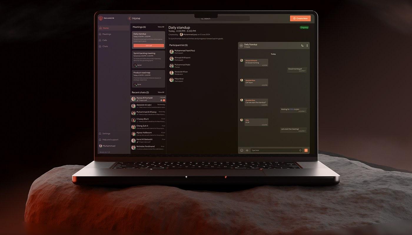
SecureLine is a secure communication application designed for the defence industry. Its military-grade encryption lets employees across the organisation collaborate and share information: they schedule meetings, message each other, and hold voice and video calls.
As Senior Product Designer I owned the design from concept to post-launch, and delivered and supported two product lifecycles.
Project goal
Design an enterprise communication app for secure communication between employees inside the organisation.
Users
Employees within the client organisation, who needed one app for official communication and scheduling.
- LegacyNew
Constraint
New designs had to build on the organisation’s existing legacy application framework and its system rules.
02 · The problem
A one-line brief
There were no product requirements, only one line from leadership: build an enterprise app for all internal employee communication. Enterprise communication platforms already existed, but none could be tailored to the organisation’s employees or meet its security needs.
- 01Tight deadline: the first key screens were due in 3 weeks.
- 02No access to users: the domain is sensitive, so direct contact with users to gather requirements was restricted.
03 · Approach
Approach
Without users to interview, I worked from the market, from the system, and from quick validation:
Essential features
- User onboarding
- Chat
- Video and audio calls
- Meetings
- Settings
- User profile
04 · Design system
One system for mobile, desktop and web
The library is organised the way it is used: foundations, then tokens, then components.
Foundations
Colour, border, layout, spacing, typography and icons, each a page of the Figma library.
Semantic tokens
54 semantic colours in five groups: 17 for content, 17 for backgrounds, 11 for borders, 7 surface levels and 2 overlays. Each name points to a different primitive in light and dark, so a component never changes when the theme does.
Variables and modes
Figma variables carry the light and dark modes across mobile, desktop and code.
Components
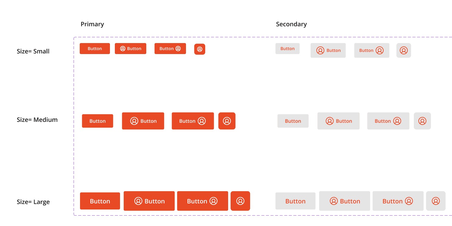
Avatars, buttons, badges, chips and tags, top, bottom and title bars, the navigation drawer, controls, text input, alerts, banners, snackbars, lists and message bubbles, with their variants and sizes for mobile and web.
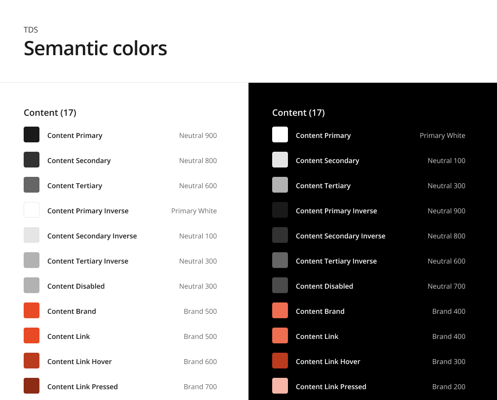
Semantic content colours in TDS v1.2, light beside dark. Same token names, different primitives.
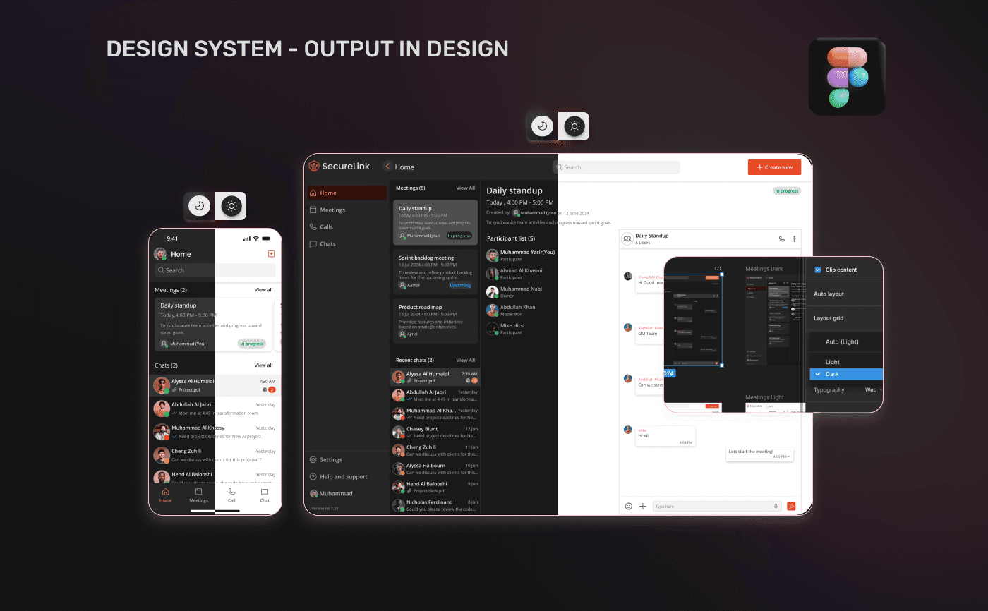
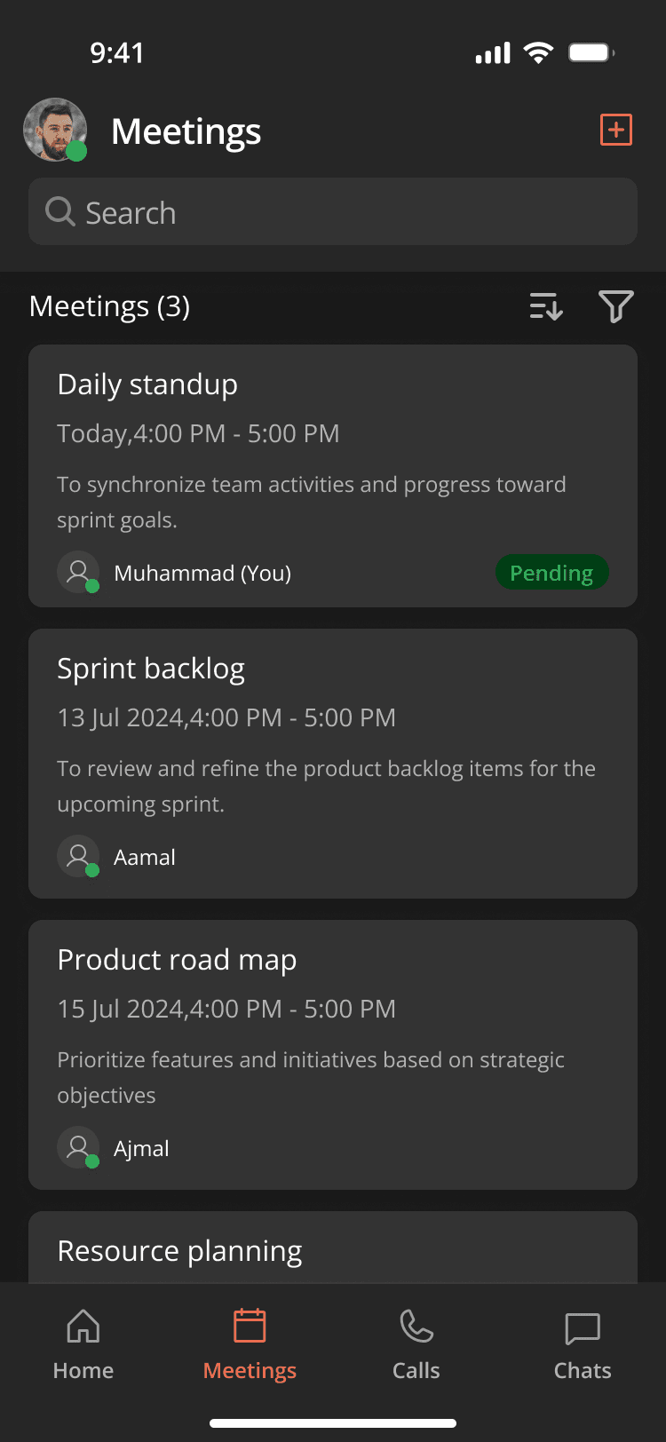
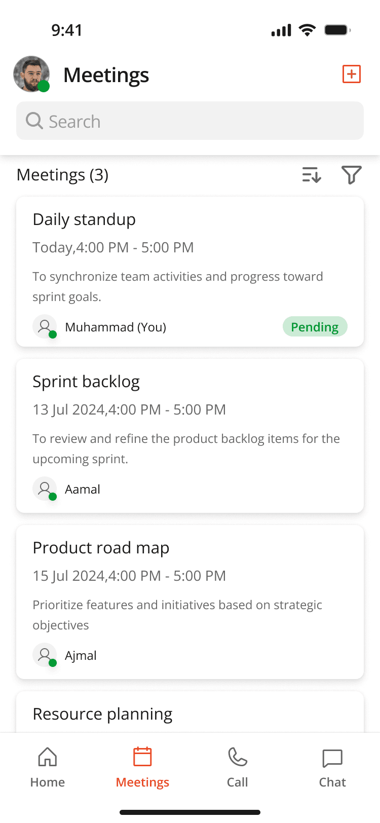
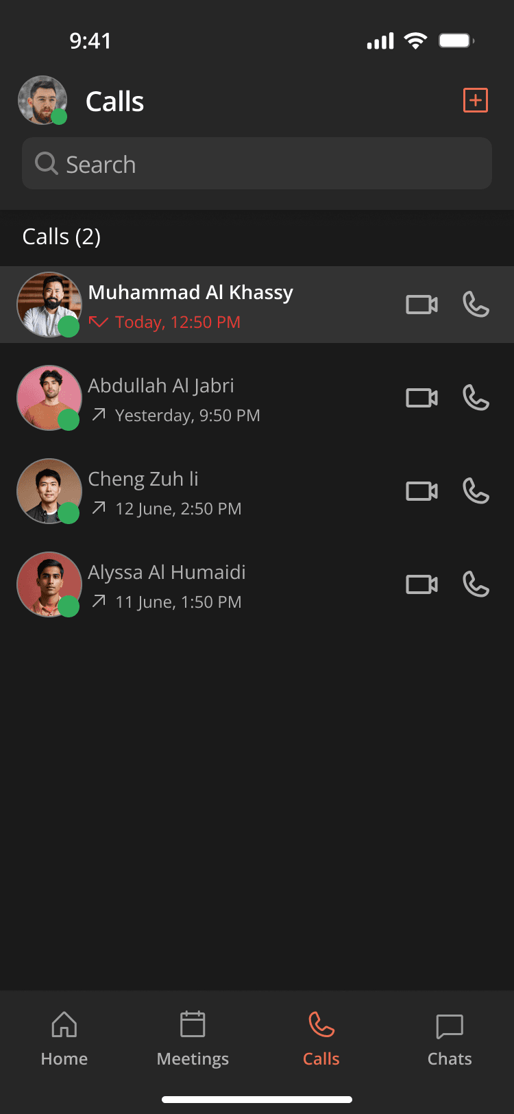
The same screens in dark and light, switched by variable mode in Figma.
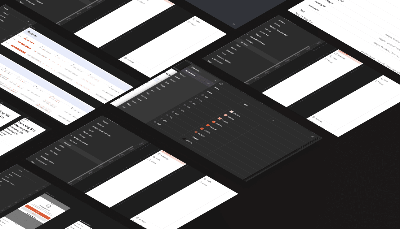
The component library.
05 · Key screens
Home, meetings, calls and one way to start anything
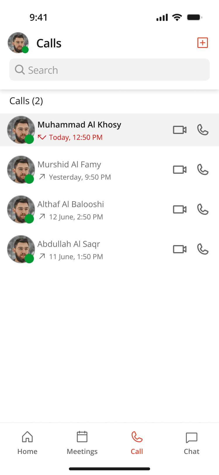
Four screens from the mobile app, exported from the product’s Figma file. Each one comes in both themes, built from the same design tokens.
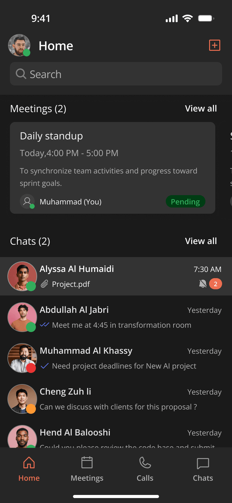
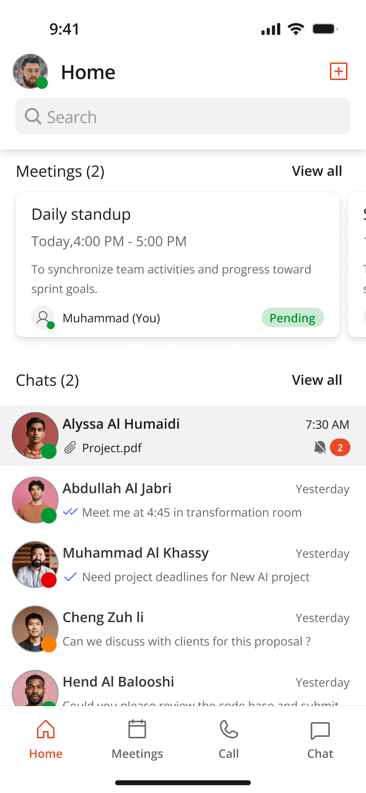
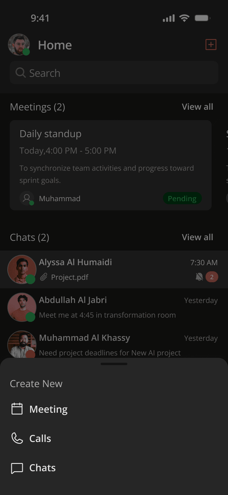
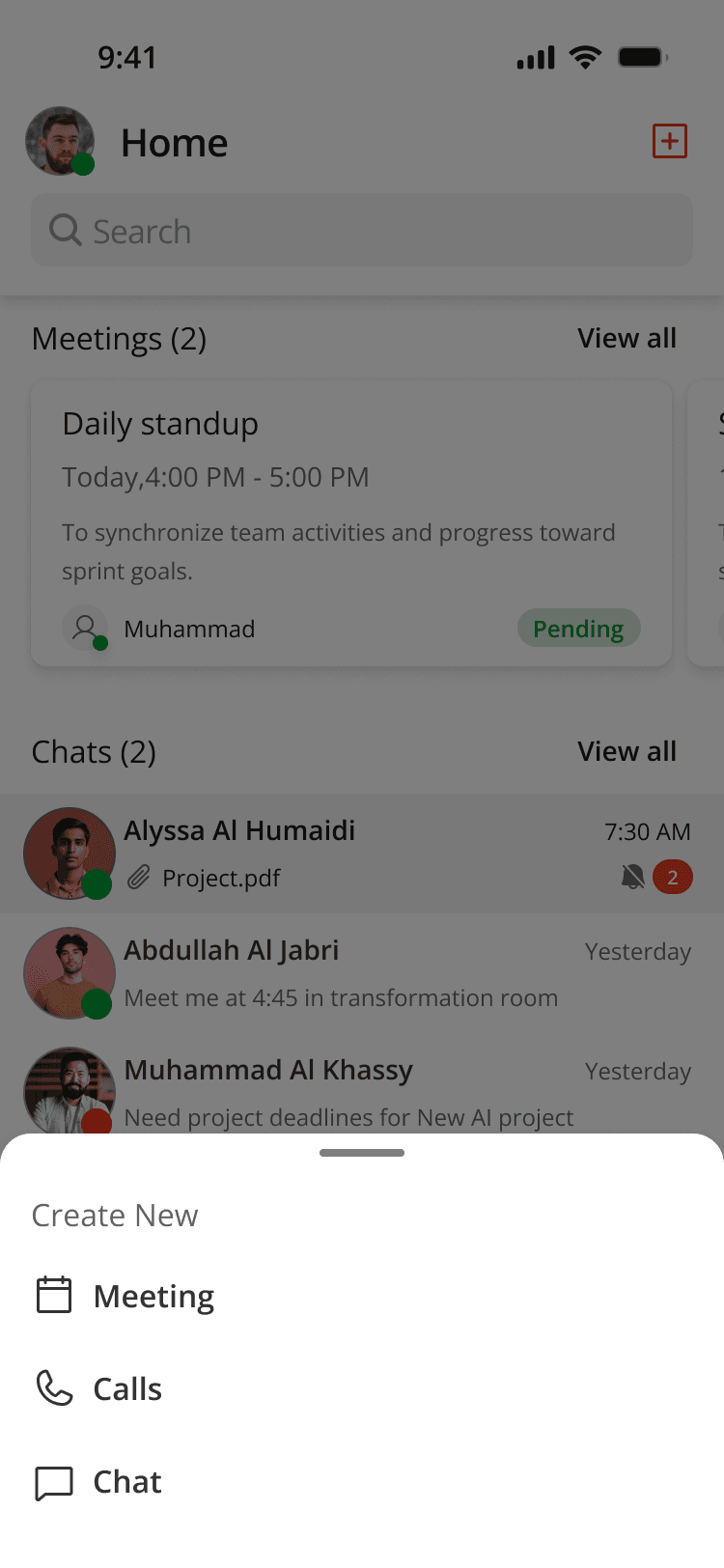
Today at a glance: the next meetings and the latest chats on one screen.
- Meetings sit at the top as swipeable cards, each with its time, purpose, organiser and status.
- Recent chats follow, with attachments, read receipts and unread counts.
- The bottom bar reaches Meetings, Calls and Chats in one tap.
06 · After launch
Requests from a custom-built product
Because the product was tailored to one organisation, its users came back with requests of their own:
- My Teams and departments
- Lets users organise and reach colleagues within their own teams and departments.
- Chats with moderators
- Users can create chat rooms and give moderators special privileges to manage discussions.
- Late design tokens
- Design tokens came into Figma near the end of the product cycle, which challenged our design plan.
07 · Accomplishments & takeaways
Accomplishments & takeaways
- 01Thrived in the understanding and concept phase, developing solutions that worked despite limited user interaction.
- 02Organised one design system to serve two product lines, saving 3 months of development time.
- 03Implementing Figma variables for the Flutter environment had a learning curve, but integrating them for dark and light mode through design tokens was ultimately rewarding.
Conclusion
“SecureLine’s pilot release shipped within the agreed timeframe, and a client has signed off on its implementation for their organisation.”
Reusable components from the design system streamlined development, and iterative usability testing earned positive feedback from potential clients. SecureLine is now a prominent product in the company’s portfolio.
Next case studies