Product design · Government sector
DubaiNow Mobile App
A design system first, then 57 services built on it in a year
- Government B2C
- 115+ services
- Design system
- iOS + Android
- Paperless strategy
- Client
- Digital Dubai government
- Role
- Customer Experience Designer
- Timeline
- Design system 4 months, services 8 months
- Results
- 57 services in a year, CSAT 70%
01 · Overview
One app for 115+ government services
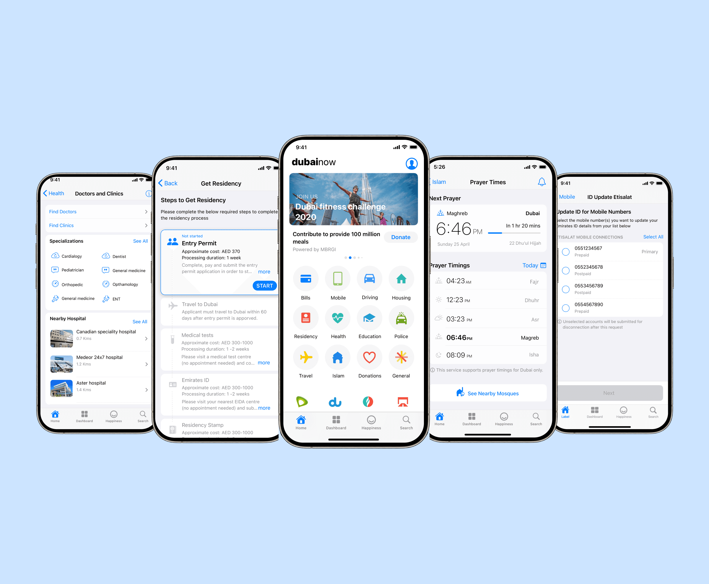
DubaiNow is the only Dubai Government app for city services, giving residents access to 115+ government services, from bills and residency to police and driving. It is part of Dubai’s paperless strategy, which moves every government service into the app.
As Customer Experience Designer I created the app’s design system, then designed services on it from concept to release and tracked how they performed.
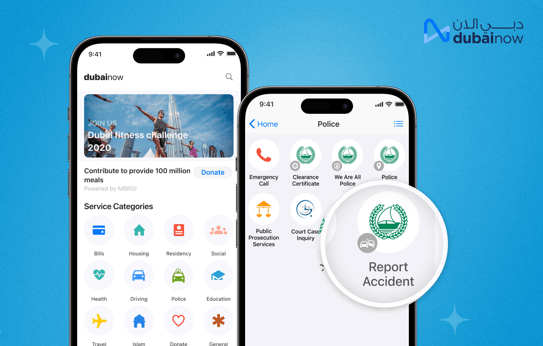
115+ services, grouped by category.
02 · The problem
Inconsistent services, and a paperless deadline
Users found the services inconsistent and confusing. Page flows changed from one service to the next, which frustrated people, raised drop-off and lowered satisfaction scores.
- 01Components were only partly reusable, and developers working in silos gave them their own behaviours.
- 02Developers had limited time to build reusable components, so new services kept reusing legacy designs.
- 03The paperless strategy needed new services in the app within months, leaving little time for research.
- Objective 1
- Reduce the drop-off rate by at least 30% within 6 months.
- Objective 2
- Redesign all 22 existing services on the new design system, to fix inconsistency and improve CSAT within 6 months.
- Objective 3
- Bring at least 20 new services into the app within 8 months, as part of the paperless strategy.
03 · Research
Analytics, app store feedback and personas
- Stakeholder workshops
- To understand the requirements of the new services.
- Data analysis
- Firebase analytics on the previous app, to see how people used it and where they dropped off.
- Secondary research
- App store feedback, and CSAT scores with feedback from the customer experience team.
- Personas
- Built from the analytics and app store reviews, segmented by usage, to keep the target users in view.
- Competitor analysis
- Popular design systems, Apple’s Human Interface Guidelines and Material Design, since the app is native.
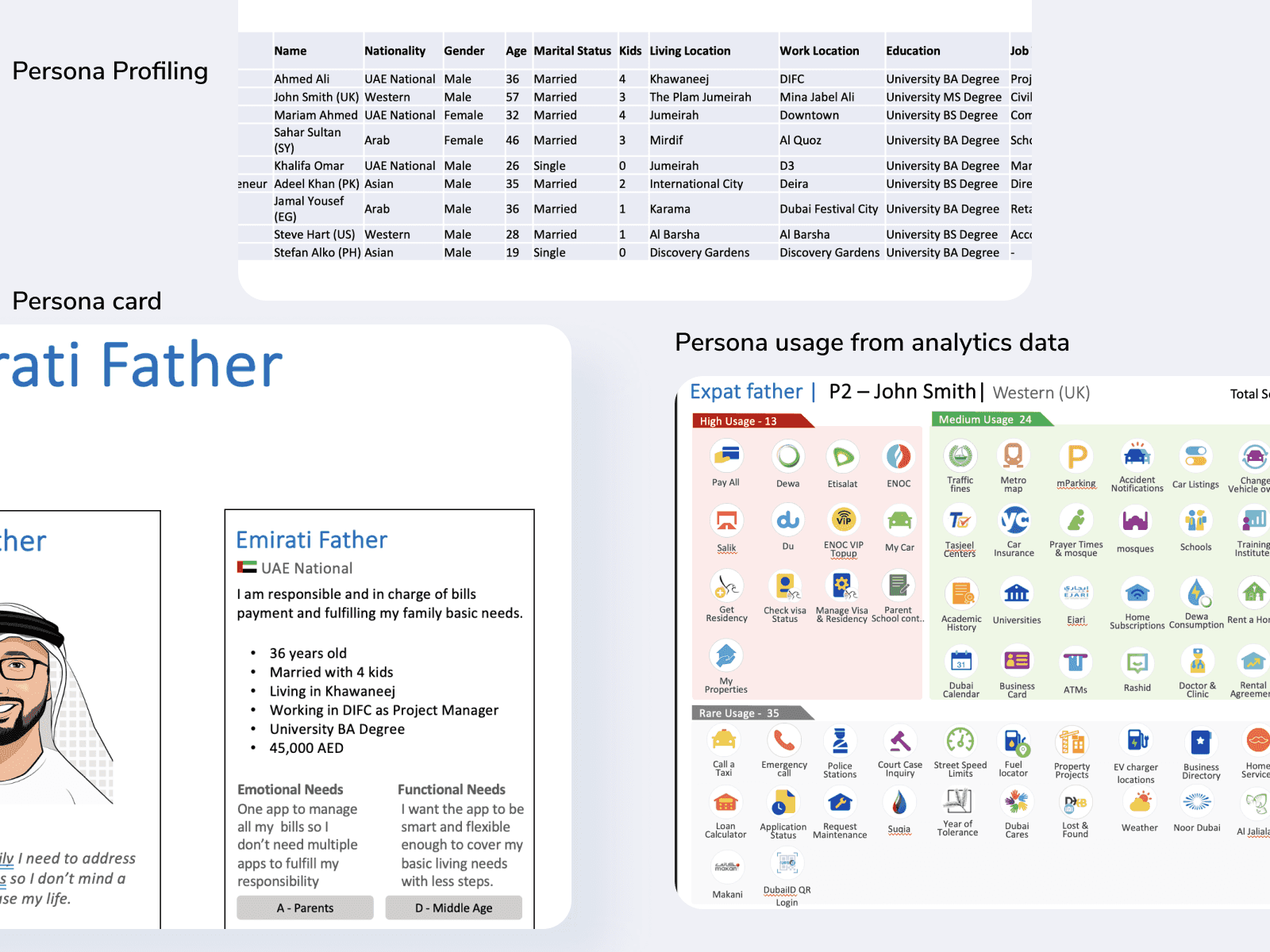
Personas segmented by real usage data.
04 · Part 1 · The design system
A shared system before more services
A reusable design system gives every squad the same components, so users get one consistent experience across services. Designers spend less time per service, and developers reuse most of what they build.
Brand workshops with stakeholders set the style as elegant, classy and modern. Typography is native, SF Pro on iOS and Roboto on Android, on an 8pt grid, with four icon families: category, microapp, microapp badge and contextual.
01
Research & audit
An inventory of existing components, reusable and not, and of the best design systems.
02
Foundations
Colour, type, scale, grid, icons and voice, defined from the new brand identity.
03
Components
Built the 20% of components that cover 80% of the UI first, then the rest.
04
Documentation
Behaviour, specs and Zeplin links in Confluence for the whole team.
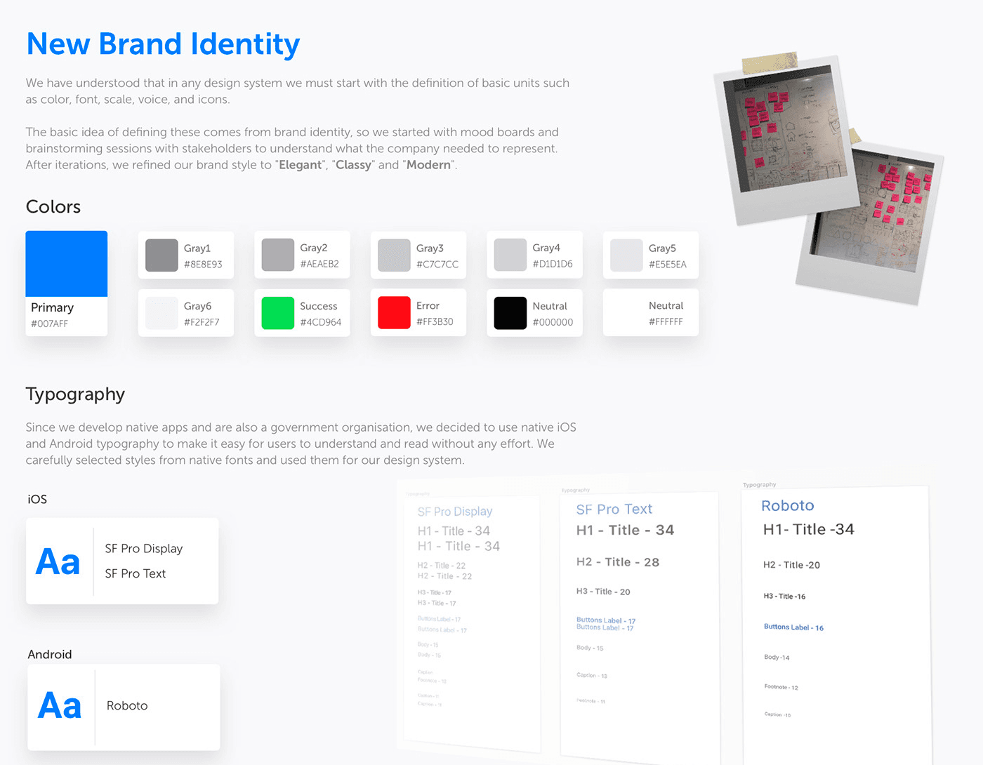
Foundations: colour, native type and an 8pt grid.
05 · Testing the system
Paper cut-outs to learn how users group components
- 01Analysed the old app’s components to find which were used most, which set the system’s priorities.
- 02Tested the designed components with users as paper cut-outs. They thought aloud as they sorted and used them.
- 03Refactored the components on that feedback, then released them. Duplicates were removed and broken components fixed.
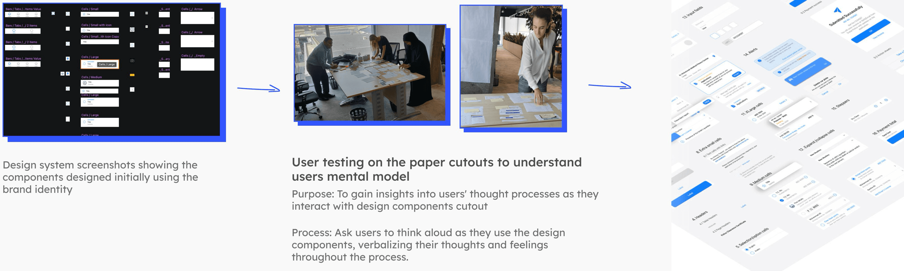
From first components, to paper testing, to the released library.
06 · Adoption
A system the whole team uses
- Education
- Weekly presentations to the whole team with success stories and challenges, followed by brainstorming. Team members helped name and explain components.
- Documentation
- An internal site in Confluence, where anyone can look up a component’s behaviour, specs, Zeplin links, constraints and best practice.
- Testing
- When developers finished a component, I ran an expert review of the built UI, then tested it again with users.
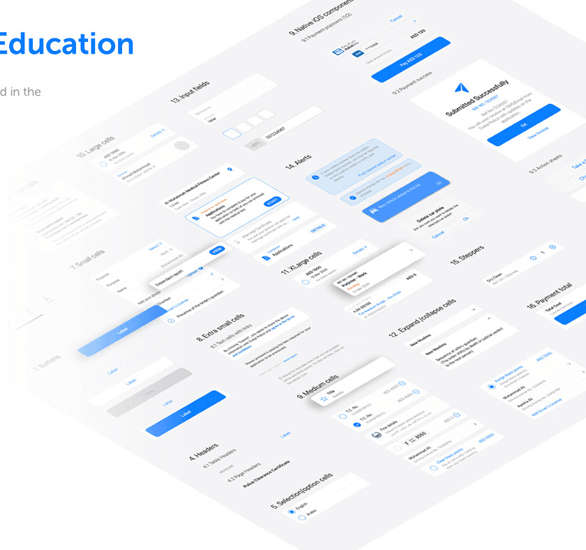
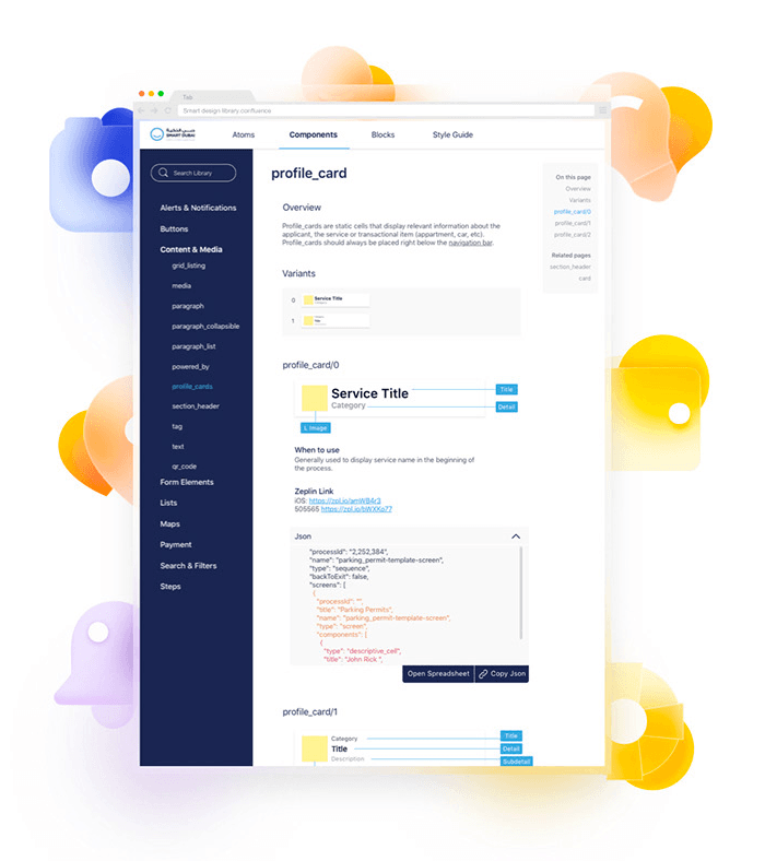
The component library, and its documentation.
07 · Part 2 · Services
Every service: requirement, service diagram, UI
Each service started with the government entity that owns it, and its requirement was sometimes a single line. I turned it into a service diagram, then designed the UI from system components. When a component was missing, I created it with its use cases and added it to the system through governance.
01 · Entity stakeholders
Understand
Gather the requirement in a meeting with the government entity.
02
Service diagram
A flow diagram, as detailed as the service’s complexity needs.
03
UI design
Screens built from design system components, with new ones governed into the system.
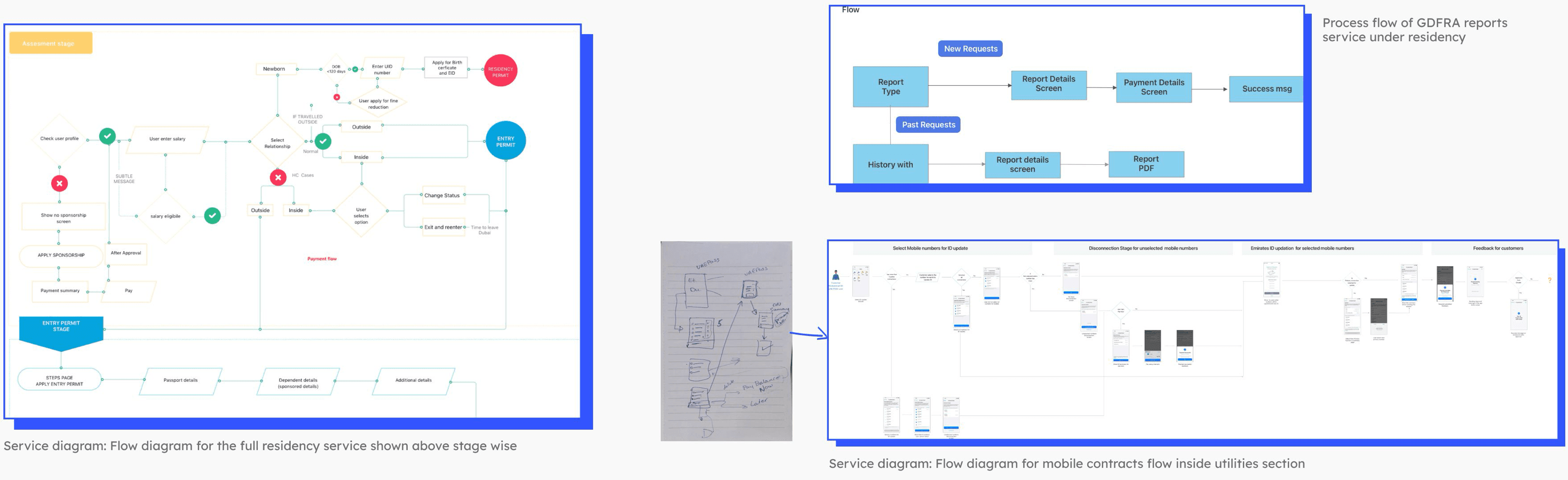
Service diagrams for residency, GDRFA reports and mobile contracts.
08 · Service redesign
Get Residency, rebuilt on the system
The same steps, costs and fields, moved onto system components: step cards with a status and a start action, grouped form fields, and the standard header, Continue button and tab bar.
Get Residency, before and after
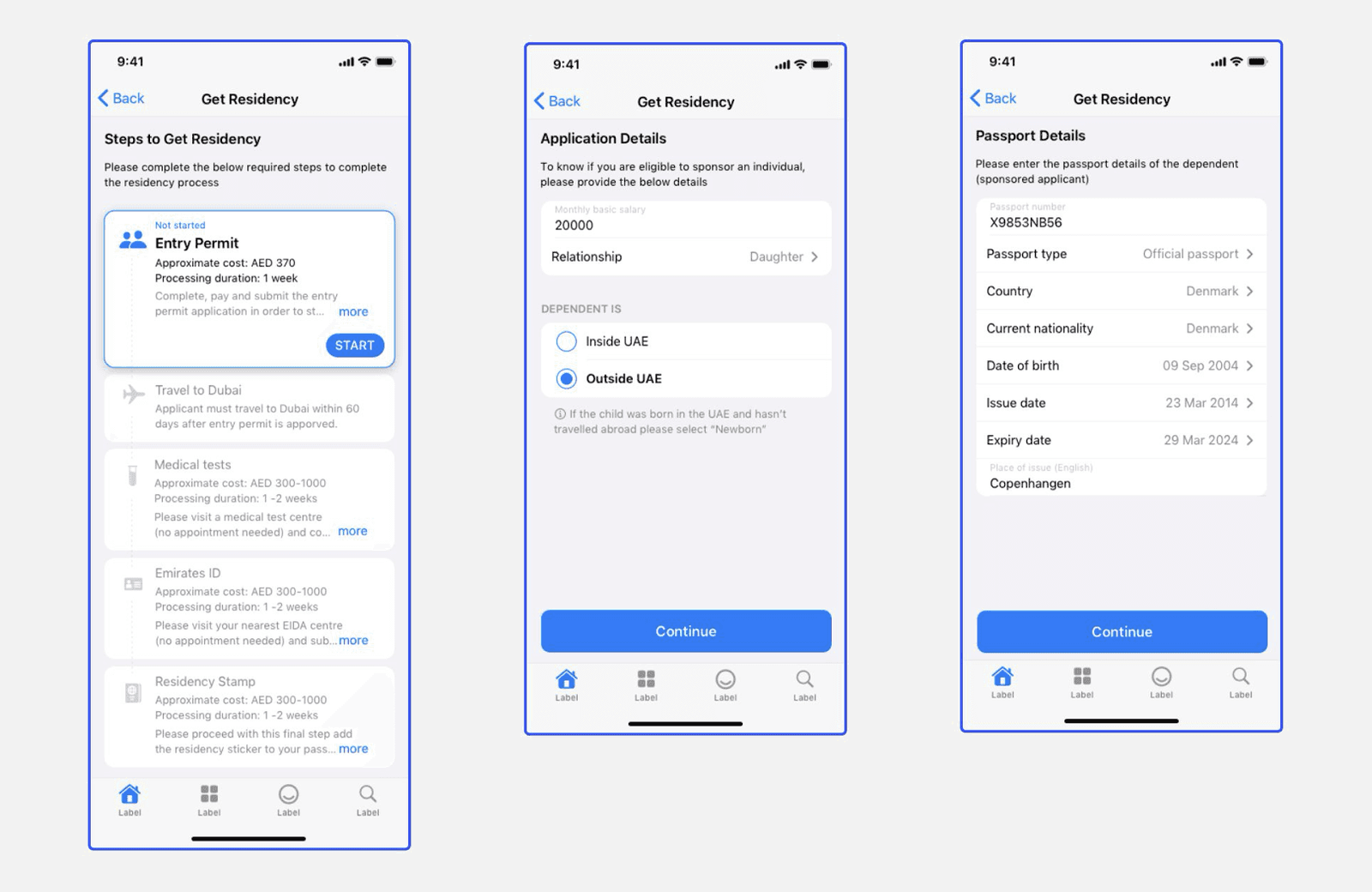
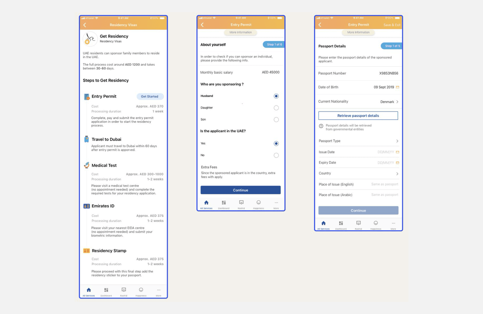
Residency category: the Get Residency service redesigned on the design system.
09 · Service in focus
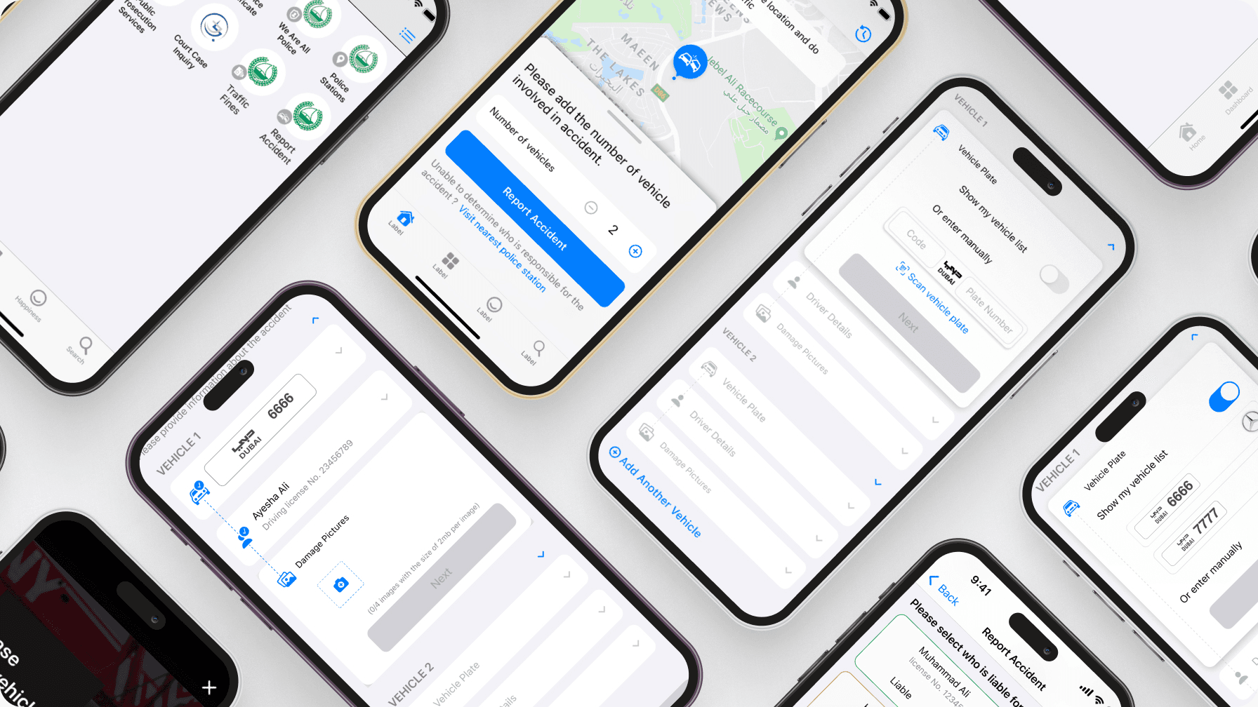
Report Accident: a collision report without a station visit
- Project goal
- A DubaiNow service to report a collision between vehicles.
- User goal
- Get an accident report to repair the car and claim the cost from insurance.
- Prerequisite
- Dubai residents and expats with UAE Pass access.
- 01The location is picked on the map first, so nobody types an address at the roadside.
- 02At least two vehicles are involved, so the vehicle count starts at 2 and can’t go lower.
- 03Saved vehicles and drivers come first, with manual entry and plate scan as fallbacks.
- 04Each vehicle gets its own plate, driver and up to four damage photos.
- 05Anyone unsure who is liable is sent to the nearest police station, not forced to guess.
01
Location & vehicles
Pin the accident on the map and set the number of vehicles.
02
Accident details
Plate, driver and damage pictures for each vehicle.
03
Liability
Select who is liable, or go to the nearest police station.
04
Report history
Submit, then see the issued report from the report history.
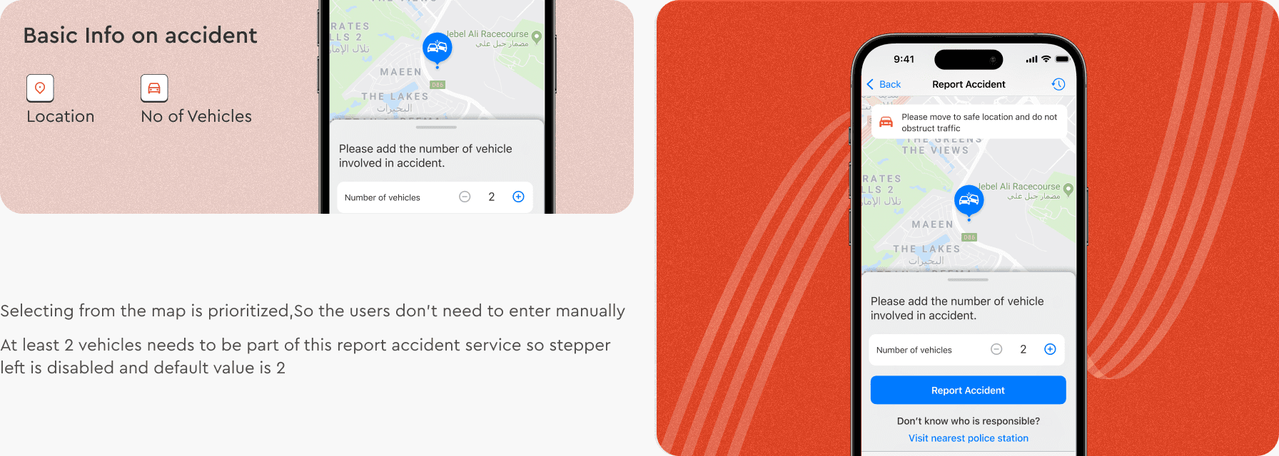
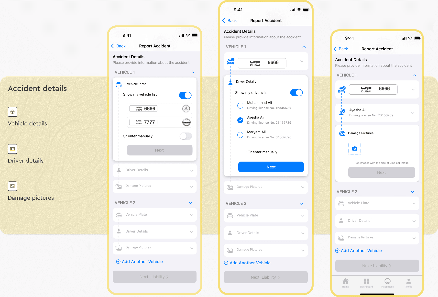
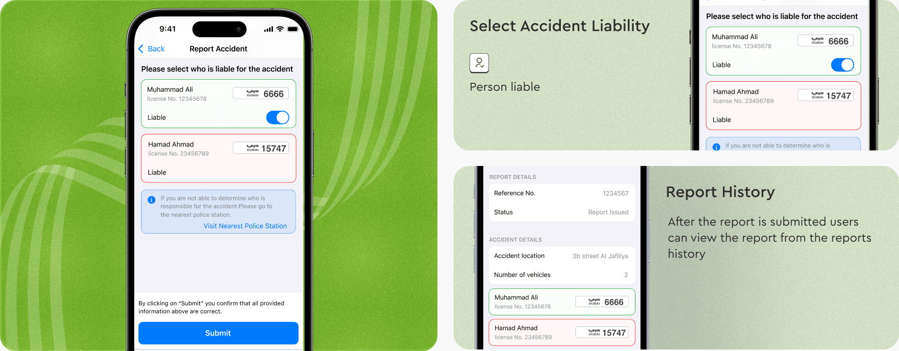
Location, accident details, then liability and the report.
10 · Results
57 services in a year, and CSAT at 70%
- New services
- 28 new services delivered within a year, against a target of 20.
- Enhanced services
- 29 existing services redesigned on the design system in the same year.
- Satisfaction
- The redesigned services reached a CSAT score of 70%, above the 60% target.
Conclusion
“The DubaiNow app, with its new brand identity and services built on one system, won ICXA’s Gold Award in 2020 for “Customer at heart of everything.””
The design system came first, and it is why 57 services could ship in a year and still feel like one app.
Next case studies